Caesarstone Canada
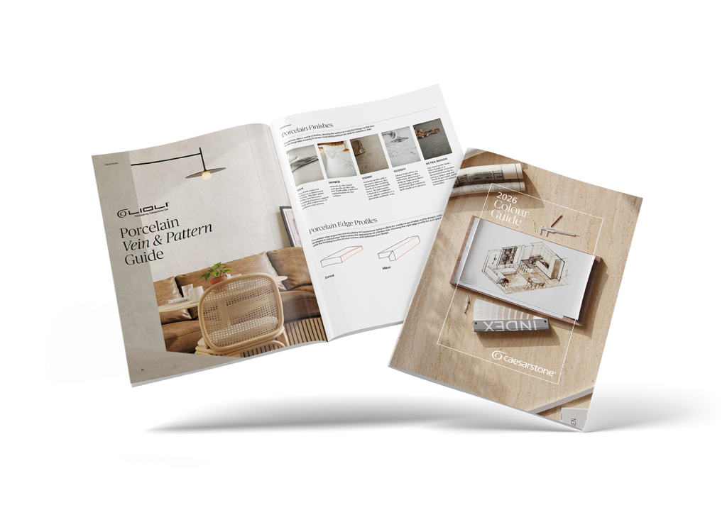
Print & Digital Designs
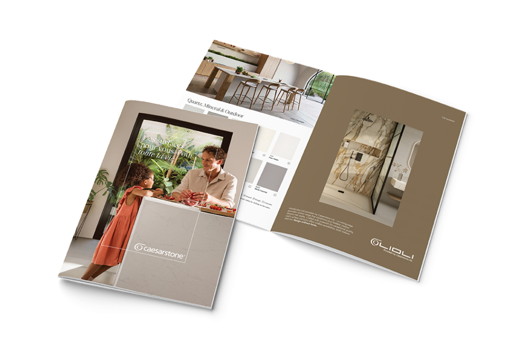
Design & Strategy Approach
Editorial-Led Luxury Aesthetic
We approached the project with an editorial mindset—designing each piece more like a design magazine than a catalogue.
Key design elements included:
Full-bleed lifestyle photography
Soft, neutral colour palettes that mirror stone tones
Minimal typography with refined hierarchy
Balanced white space for visual breathing room
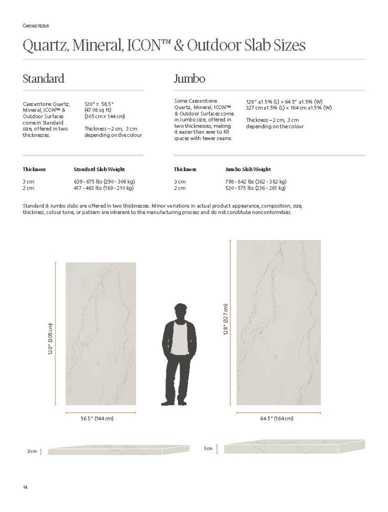
Large-format imagery to highlight veining and surface depth
The goal was to create materials that feel collectible and premium rather than purely transactional.
Lifestyle Meets Specification
Each guide balances emotional inspiration with technical clarity.
For example:
Lifestyle spreads show surfaces integrated into real homes.
Vein & pattern guides provide detailed close-ups.
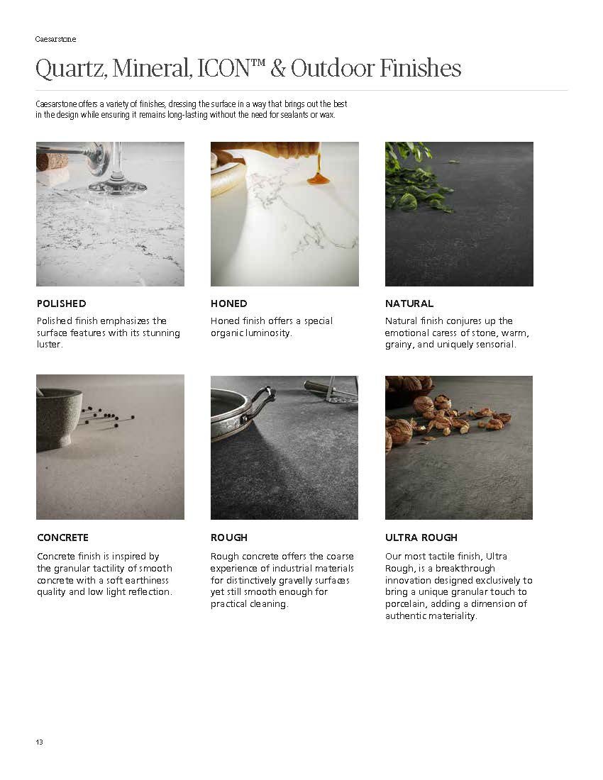
Edge profiles and finish breakdowns support spec decisions.
Colour swatches and finish descriptions offer clarity for designers.
This dual-purpose structure ensures the materials work for both inspiration and specification.
Brand Consistency Across Formats
The 2026 Colour Guide, porcelain collections, and quartz brochures share:
Consistent typography
Cohesive layout grid systems
Repeating brand framing elements
Subtle logo placement
Harmonized colour direction
This strengthens brand recognition across all touchpoints—showrooms, trade events, and direct mail campaigns.
Print Production Strategy
Premium print execution was critical.
Paper & Finish Selection
Heavy-weight uncoated stocks to enhance texture
Matte finishes to avoid glare and preserve colour accuracy
Soft-touch covers for tactile luxury feel
High-resolution offset printing for colour precision
Paper choices were carefully selected to complement the natural, organic aesthetic of stone surfaces.